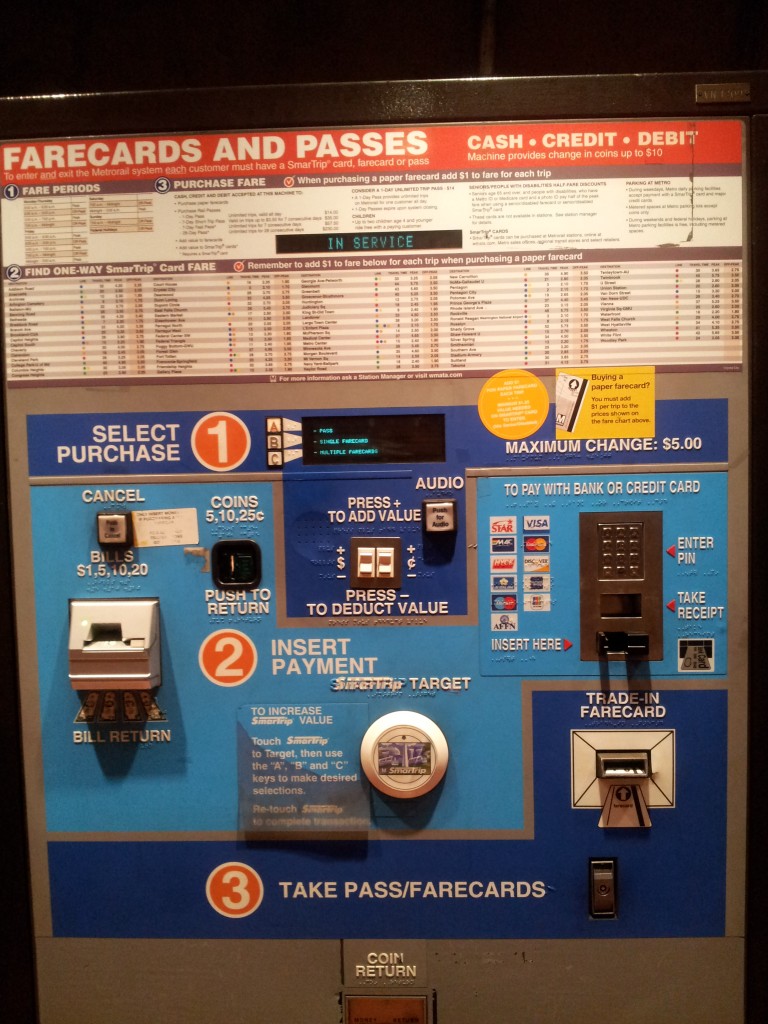
Here’s an example of an incredibly terrible — and dizzying — user interface, or UI. This is a farecard station in Virginia or Washington DC (I can’t quite remember).
My friend Dan and I are from New York, where the MetroCard stations are incredibly simple to use. We reacted exactly the same way as we came upon this farecard station: “What the hell is this?”
We spent about five minutes trying to figure the process out. (That’s four minutes too long.) We then requested the assistance of a very nice ticket booth clerk, and it took her another twenty-five minutes to explain it all to us.
Let’s look at a few examples of why the UI fails.
Note the “CASH • CREDIT • DEBIT” heading in the upper right hand corner. Beneath it you’ll note that you can get up to $10 in change during your transaction. But then, in the blue section marked “1” in which you can select a purchase, the maximum change is $5. Which is it?
Under the “FARECARDS AND PASSES” section you’ll note “1 FARE PERIODS,” “2 FIND ONE-WAY SmarTrip Card FARE,” and “3 PURCHASE FARE.” The horizontal space below items “1” and “3” are shared, but item “2” has its own horizontal space. Also, items “1” and “3” share the same heading space; that is, both are on the same baseline and share the same brown background color.
The next section takes a numerical, top-down approach (“1” on the top to start the purchase and “3” on the bottom to retrieve the farecard), but fuses elements of left-to-right navigation (in step “2” you can pay with cash on the left using the bill drawer or with a credit card on the right using a card swiper).
Note the coin return all the way at the bottom. Why not put that directly beneath the coin slot above item “2 INSERT PAYMENT”?