Another poor UI design. Adding a database using this layout is quite easy: click the icon with the plus (“+”) character over it.
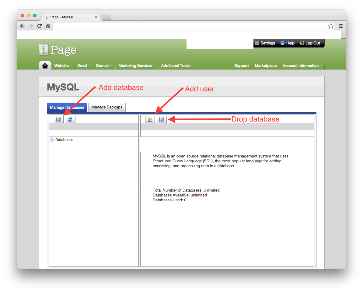
Dropping a database, however, isn’t immediately obvious. The icon to do so appears to the right of the “add user” icon, in the right section of the page. It’s likely there because the UI designer(s) didn’t want users to mistakenly delete databases.
OK. Understood. But, why not place the icon along the same row as the add database feature, but along the right margin?

Ehh, but that’s not the end of it! Wait until somebody drops the whole thing while trying to adding a user. (Bobby tables much?)
I hope there’s at least two confirmation dialogs in there.